In order to reach the biggest audience possible for your website, it needs to be built with a responsive design. Statistics show that over 50% of website visitors are using a mobile device.Compare that against a 44% tally for desktop visitors and you’ll see why it is important to have a website that formats properly on any device. While just over 4% of visitors are using tablets, they too, should not be ignored.
The fact is, if a visitor encounters a display or functionality error, they will most likely leave the site and go to a competitor. That is not good for business and may actually harm your rankings in the search engines. The more engaged a visitor is with the content, the more valuable that web page becomes in the eyes of Google. Conversely, if that user leaves that page and website immediately after visiting, it is a sign that the information is unsatisfactory.
So how do you balance content and functionality for all devices? It’s not easy. But with a little patience and some CSS optimization, you can make sure your website looks and behaves great no matter what device is used. Also remember, that the font sizing is the same regardless of which browser or device people are using, so your logo would be the same across the board for instance. We can have a quick look at Kiasu Print to see how they are managing this task, just try to open that site and resize the window so see how it fits.
Check for issues using the shrinking browser method
On your desktop, choose your favorite web browser and load up your website. It can be any browser, but let’s use Chrome in this example. With your website fully loaded, click on the restore down button. It is between the minimize and close buttons and looks like a square overlapping another. Now your browser window will unsnap from full screen.
Next, you’ll take your mouse cursor and hover over the edge of that browser window. When you see it change to two arrows pointing in opposite directions, click and drag to make the window bigger or smaller. If your website is responsive, the content should be either expanding horizontally or becoming more narrow and vertical. Of course, no visitors to your website will be doing this. However, it will allow you to see a breakpoint pixel-by-pixel. Take note of any display problems such as overlapping text and images, misaligned menu buttons, and content columns that might be too squished.
While this can be done in any browser, I did mention using Chrome for a reason. The ability to inspect an element and apply CSS changes in real-time makes it my preferred choice for responsive website design testing. There is also a free Chrome extension called Viewport Dimensions which will output resolution breakpoints when window re-sizing. This information can be extremely useful when used with CSS media queries.
Balancing the visibility of content
Visitors going to your website on a desktop computer have the advantage of more screen space. Call to actions (CTAs), widgets, and other pieces of content can be displayed quite easily without disrupting the natural flow of the website. Mobile visitors, of course, have a much more compact screen. Therefore, you need to decide what is more important when prioritizing content. You want to have an immediate impact and grab their attention. The best way to do this is to make sure only the best information is above the fold.
In the following example, you’ll see a website that has a responsive design but isn’t fully optimized. I am not affiliated with this website or business. It is also not my intention to shame or ridicule the design firm. I merely wish to point out several issues which arise when the viewport shrinks.
Desktop Website Example

Nothing out of the ordinary here. Information is arranged well and browsing should be a pleasant experience. The core elements include the menu, phone number/contact info, an attention-grabbing tagline, cta button, and a descriptive header tag.
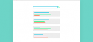
Mobile (Tablet) Website Example

Things start to get a little wonky around the 770px window width. Granted, there may be only a small range of 10-15px window width difference before things start to look better. However, every pixel should be accounted for. Assigning CSS classes and using media queries to target maximum and minimum resolution breakpoints could fix these issues.
For instance, the phone number is way too large at this resolution. It would be easy to implement a snippet of CSS code such as this:
@media only screen and (max-width: 810px) and (min-width:760px) {
 .myphoneclass {
 font-size:30px;
 }
 }
The result shrinks the phone number down to a size that fits the design style but doesn’t cause the overlapping issue. When the viewport passes below the minimum width assigned to our phone number class, the original font size will be restored. Other things such as the padding of the menu buttons and font size of the tagline, “Accused of a crime”, can be reduced. This would not only fix the menu overlapping problem, but also increase vertical screen space and bring that header tagline back above the fold.
Mobile (Phone) Website Example

This is a screen capture from my LG G4 Phone. Notice how the call to action button is cut off. Either the search bar can be made hidden and/or the tagline could be reduced in size. A simple CSS attribute of display:none; makes it easy to hide content that should be at the bottom of your priority list. Interestingly enough, mobile users are greeted with a form for the free consultation right below the free consultation cta button! It makes no sense to have both. One or the other should be removed.
Put yourself in the role of the visitor
As a designer, it is only natural to want to cram as much information as possible at the top of a website. The key thing to remember is to offer something of value to visitors for above the fold content. The business name, phone number, and call to action help to build a rapport. The search bar? Not so much. Chances are that visitor would get to a page more often through Google than through an internal search function.
If you’re not a designer but need a professionally designed website, you should consider choosing a website design company that takes responsive design seriously. Every visitor and device should be treated equally, your product or service will greatly benefit from that mindset.